Utilities Dashboard
Overview
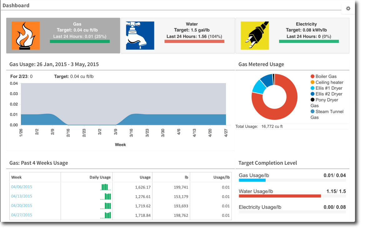
The UtiliPulse Dashboard gives you at a glance your utilities used per pound of finished product for the day, week, and month. Clicking the tiles at the top of the page shifts the data display between the three utilities: gas, water, electricity.
Example Report
The Utilities Dashboard.

Glossary
Tiles
The three tiles at the top of the screen give you the data for the three main utility categories: gas, water, and electricity. The tiles scroll through the information about your plant’s utility use for the day, week, and the month. Red and green bars indicate if your plant is achieving its efficiency goals or targets. Clicking the tiles refreshes the page for detailed information about the selected utility.
Target:
The Target varies depending on the context, but for the utilities dashboard, the Target is the maximum amount of utilities per pound of finished product for the utility.
Usage for the Week chart
The Usage chart is a graph of the last seven days of production. The blue area shows the utility use; the gray area represents your target.
Past Four Weeks Usage
The Past Four Weeks Usage table breaks the utility use out for the last four weeks of production. Clicking the date takes you to the Utilities Detail Report.
Target Completion Levels
The Target Completion Levels gives you a graphical view of how your utility use compares to the targets for all three utilities.